"Shower Thoughts" is a daily deep cleanse for your mind -- a mood tracking and journaling app utilizing Cognitive Behavioral Therapy principles. For this project, I worked on my own within a two-week design sprint.
Challenge
The goal of this project is to design an app that (1) focuses on a category of personal wellbeing, (2) pushes the user to commit to a healthier lifestyle, and (3) reflects a fresh, updated image.
I decided to focus on emotional wellbeing. While the market is already heavily saturated with apps focusing on physical health, emotional health is currently underrepresented in the app space despite this topic trending amongst millennials in recent years. Meanwhile, two-thirds of Americans diagnosed with depression don't get treatment, while those who do seek treatment wait years to get help and are often under-treated. Therefore, I was interested in designing a tool that could provide a way to cope, supplemental treatment, or even a preventative measure for those struggling with emotional wellbeing.
Approach
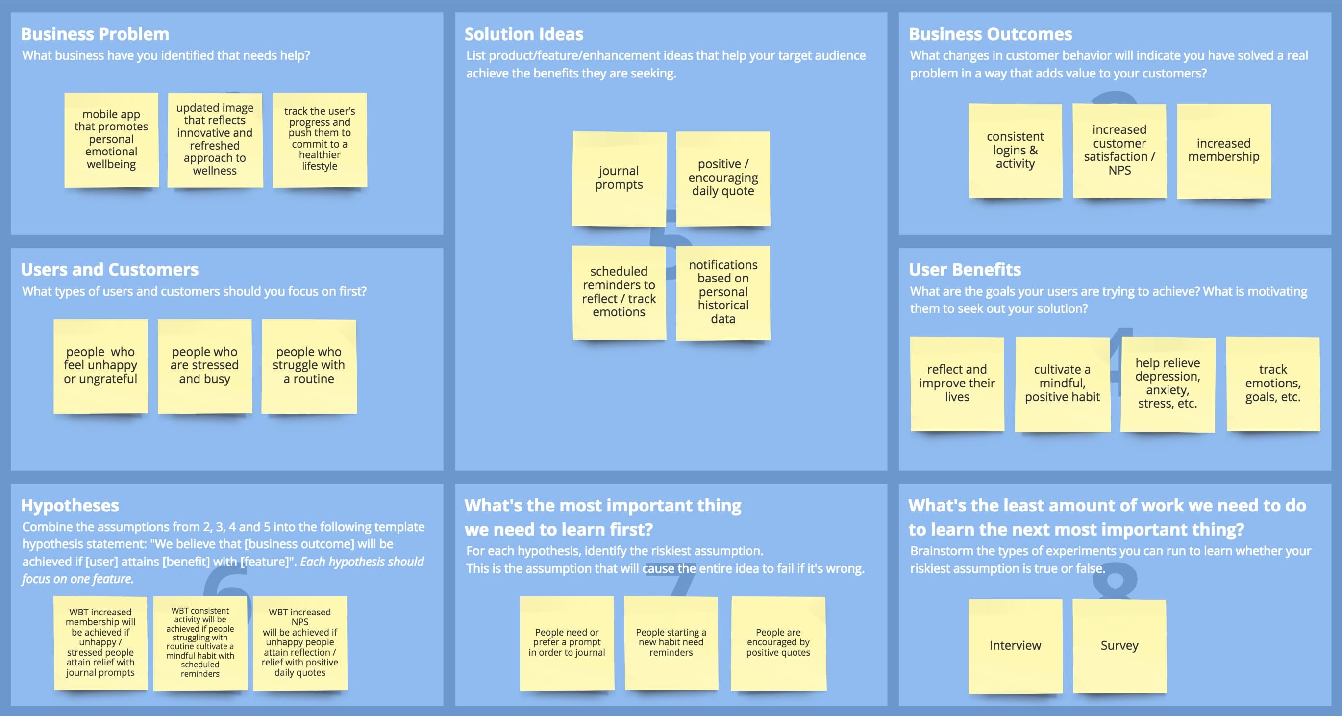
The first step was to break down the problem.
Using a Lean UX Canvas, I drafted a few hypotheses along with
corresponding business outcomes that could gauge the success of the app.
I researched potential
competitors -- namely, the top (free) apps featured in this list I found
in the App Store... 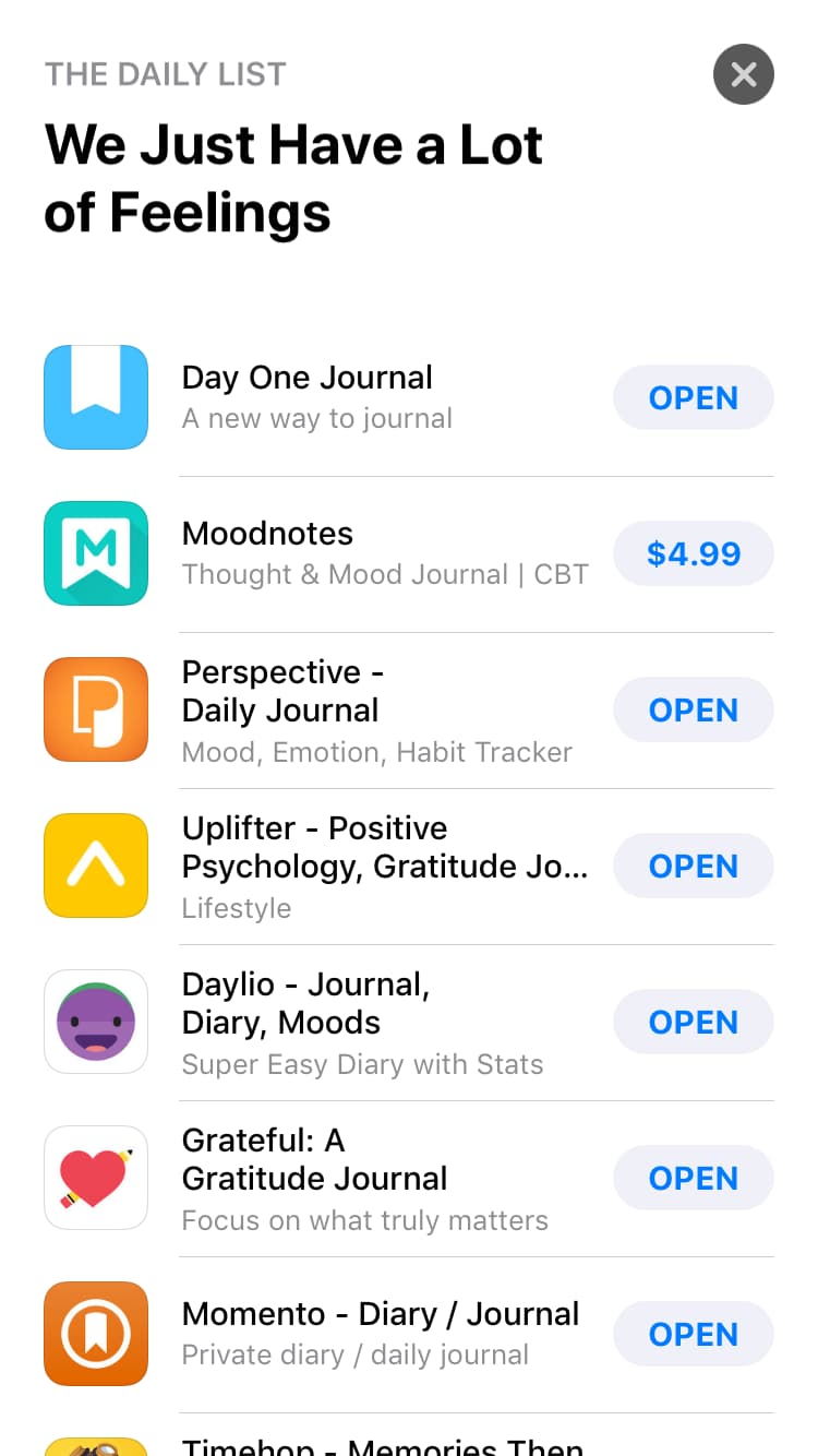
...and downloaded them all to test and compare their
features. 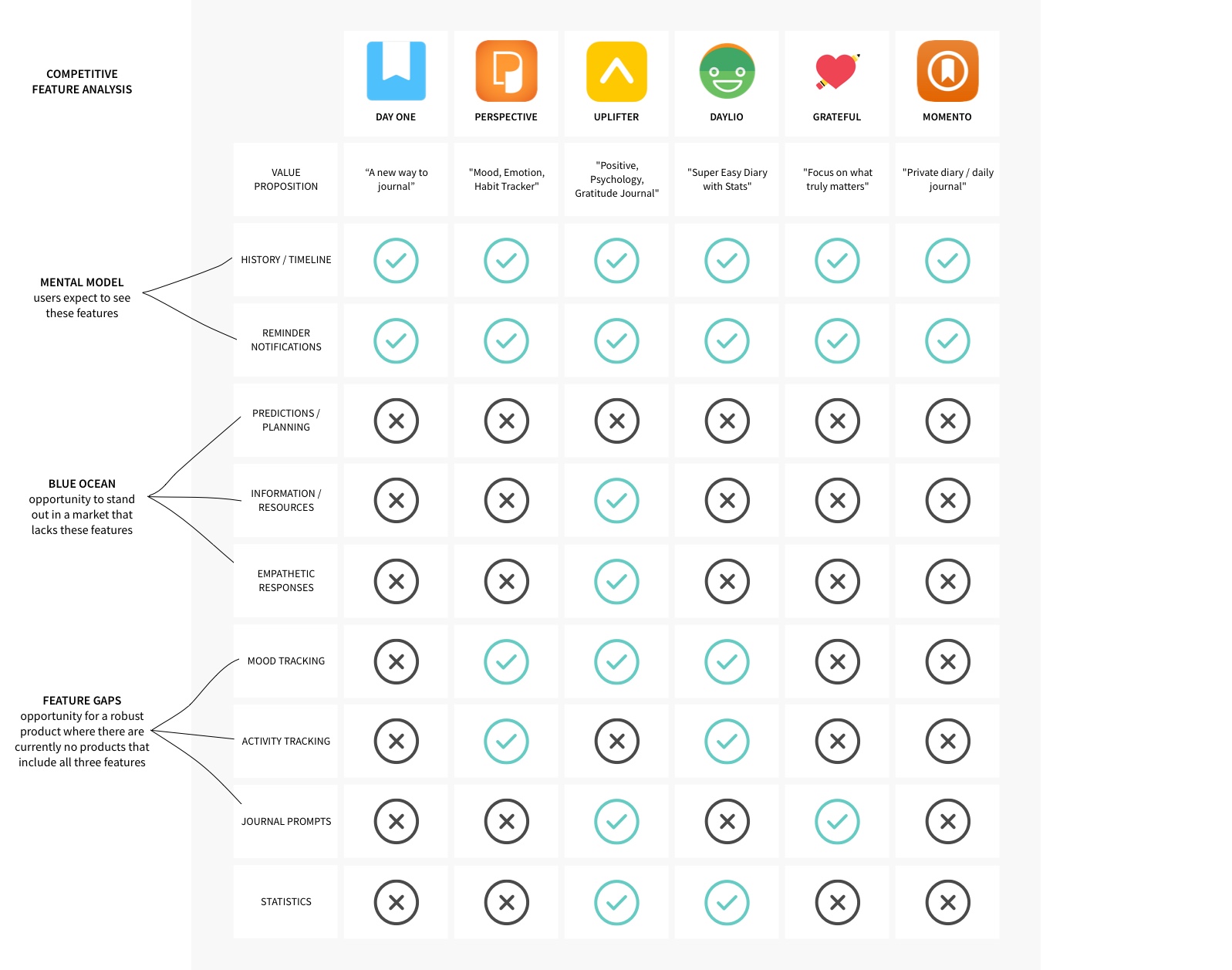
While
testing many of these apps, I felt overwhelmed by the amount of choices
in tasks, features, and navigation. To differentiate my product, I
would position it to feel more "guided" instead of "freeform" -- it
should be as clear as possible to the user where to start and what to
do. Additionally, the goal for many of these apps seemed to end with
recording feelings, thoughts, or life events rather than pushing the
user make progress in their wellbeing. There was a "blue ocean" when it
comes to apps that both guided the user and helped the user to
self-improve. 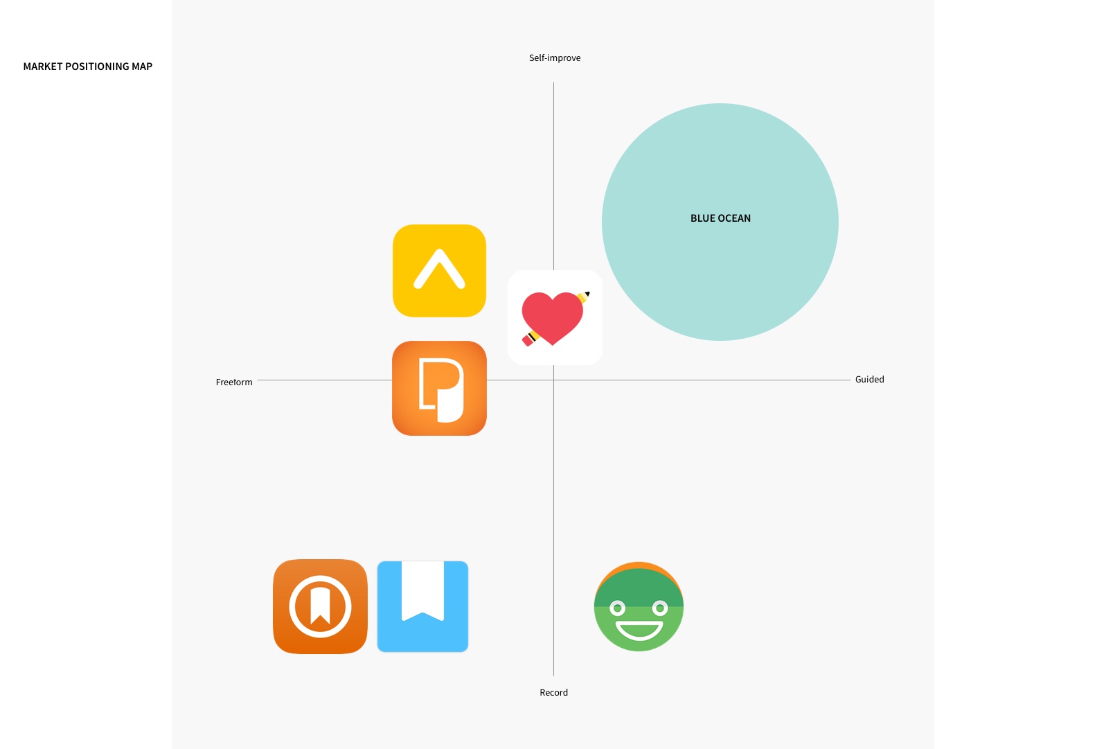
Discovery
The next step was to understand my target users -- in this case, busy millenials interested in improving their emotional wellbeing.
I interviewed 6 individuals to gather qualitative
data on their current habits, motivations, and frustrations.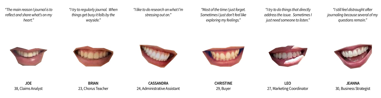
I also conducted a survey to gather
quantitative data on my target users' goals, needs, and pain points --
and to confirm or reject any hypotheses from the start of the project. I
would soon discover the importance of this step when the survey data I
had gathered failed to support one of my initial hypotheses. An early
assumption was that people struggling with emotional wellbeing would
find relief or encouragement from positive, inspirational quotes. As it
turns out, survey respondents tend to find "practical help or advice"
most encouraging, followed by "feeling heard, a listening ear". 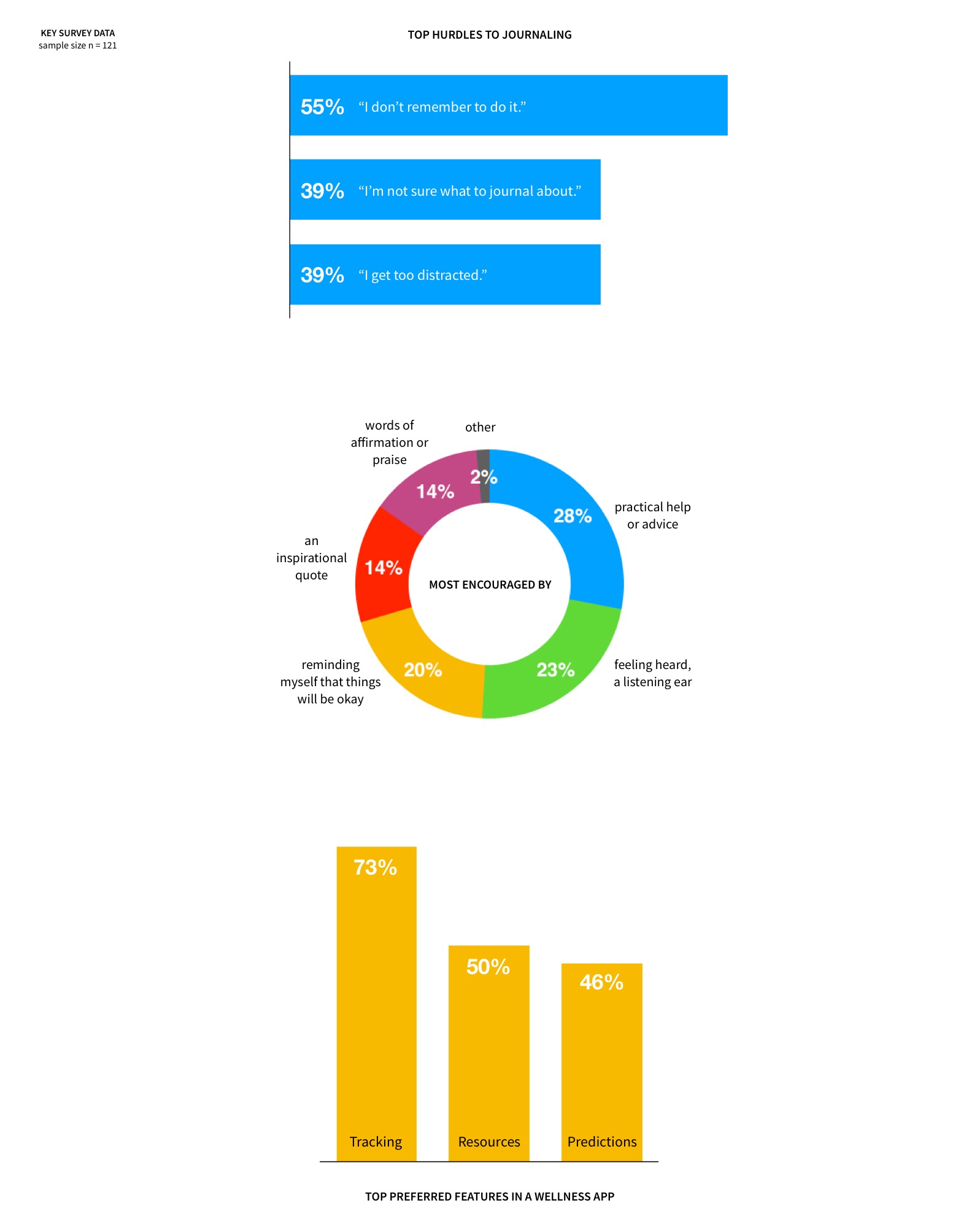
To help me find patterns in the
data I've collected, I utilzied the affinity diagram method to cluster
my notes into major themes.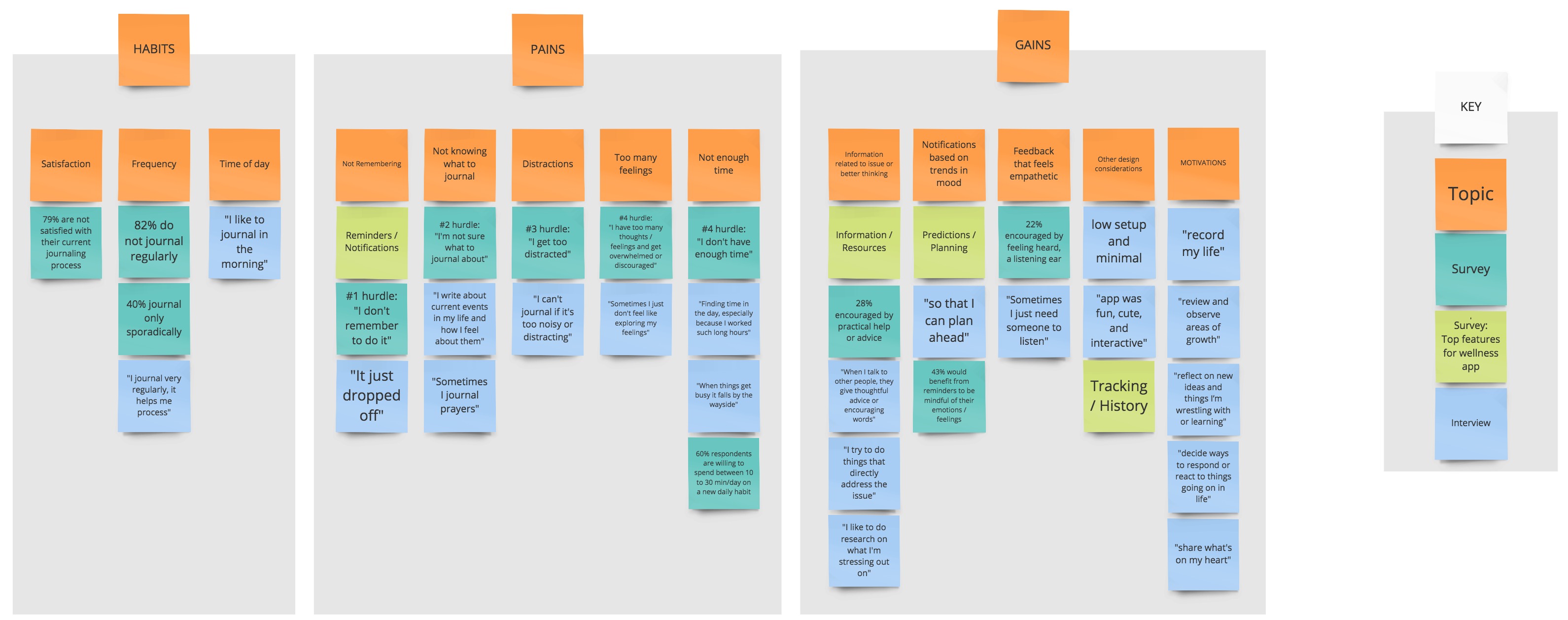
I put
a face to my insights - particularly demographic, interests, and top
pains and gains - by creating a user persona...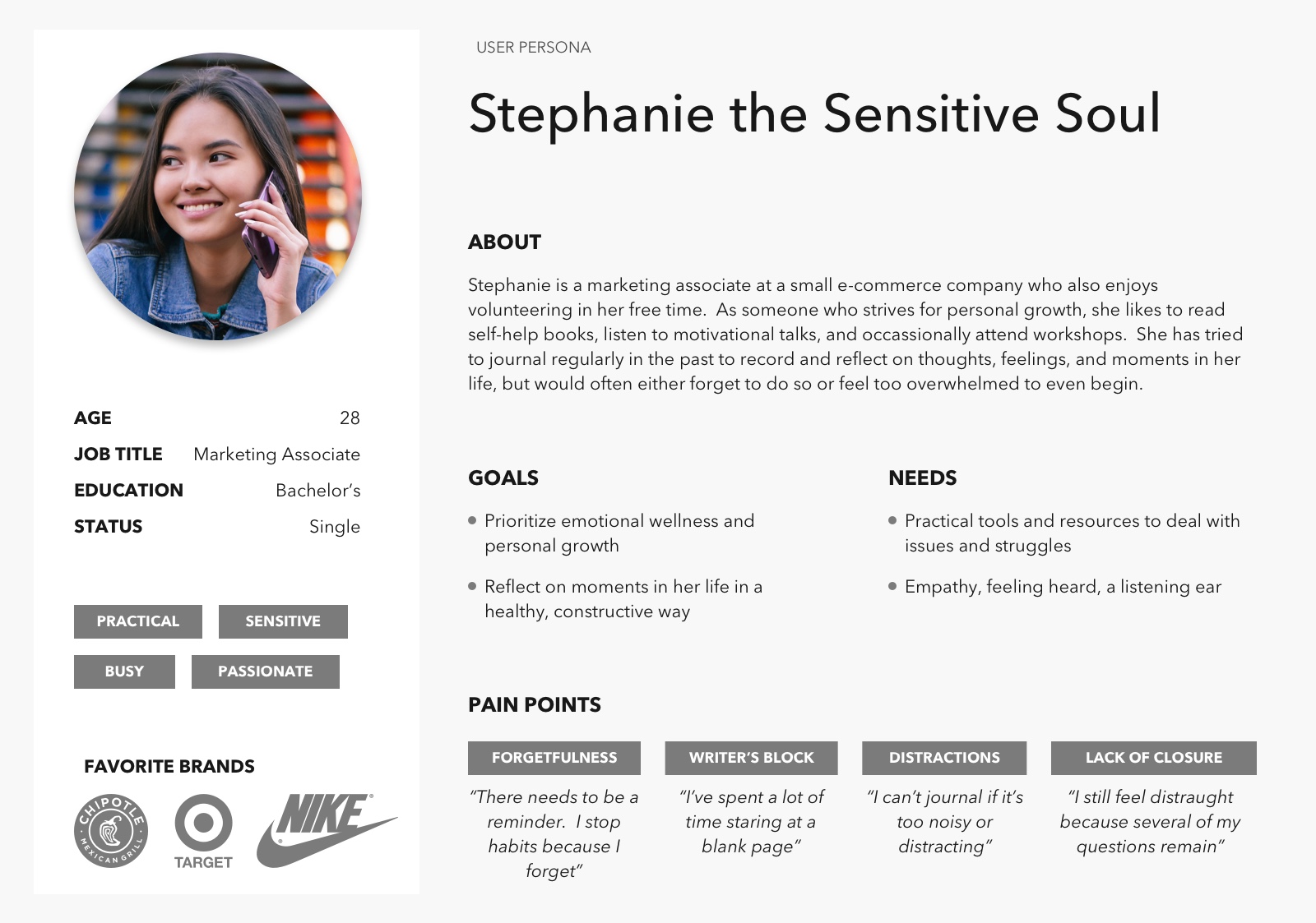
...and context for the
user's main pain points by creating her journey.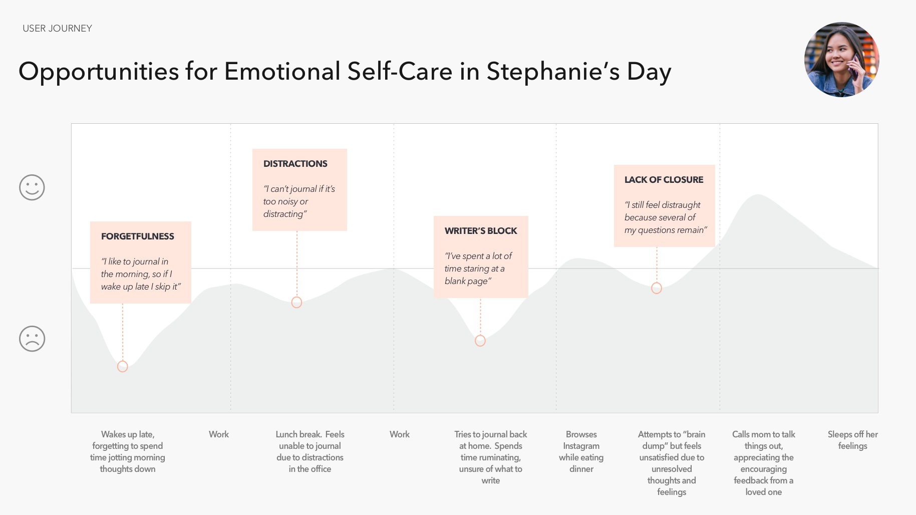
Solution
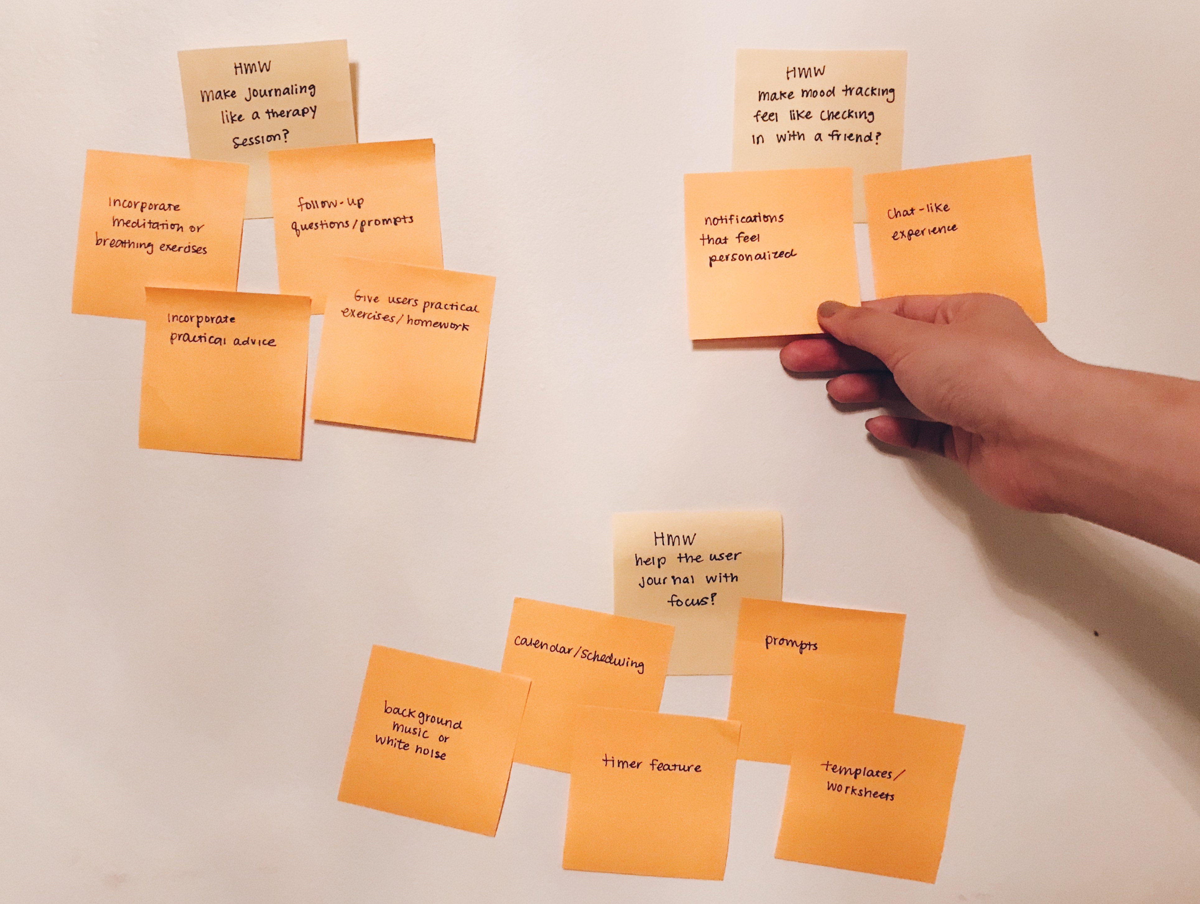
During the ideation process, I considered how I might...
- ...make journaling like a therapy session?
- ...make mood and activity tracking feel more like self-care (and less like a chore)?
- ...keep the user focused while journaling?
I then prioritized my
various feature ideas using the MOSCOW method, taking into consideration
impact vs effort. From there, I determined what the minimum viable
product would consist of. 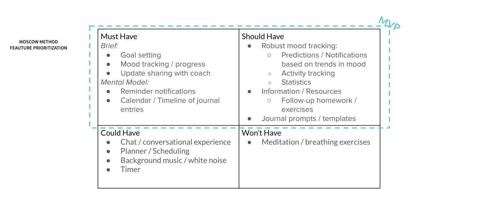
Meanwhile, I also read up on evidence-based methods for managing depression and anxiety. Because my target users preferred practical help and advice, I believed my product would benefit them more if its tools could be backed up with empirical evidence. I then learned about Cognitive Behavioral Therapy -- a technique that has been shown to be just as effective as medication, with additional long-term results. Interestingly, CBT lends itself naturally to mood and activity tracking, as well as journaling, so I decided to incoporate CBT principles into my product.
Finally, I created the user flow to define the screens
and actions needed for a user to complete their main goals of
recording their mood, recording their activities, and journaling their
thoughts, followed by an activity to challenge and re-write those
thoughts using CBT principles.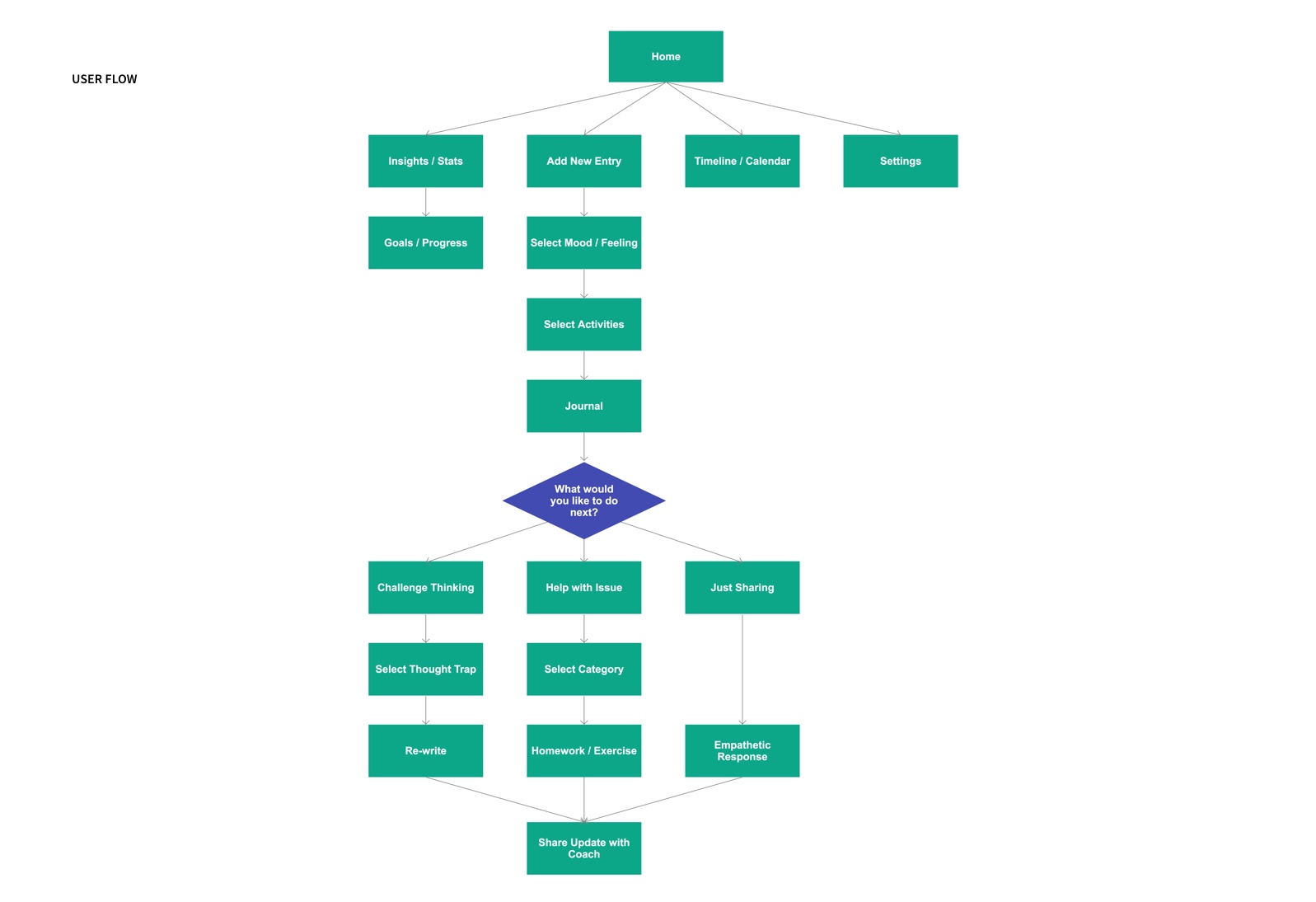
Implementation
Lo-Fidelity
I made a quick paper
prototype of my app's "happy path", but decided to pivot slightly by
removing the "help with issue" user flow and instead adding a learning
section after observing users hesitating when presented with three
different options. While this streamlined the happy path, I also
believed the new user flow would better equip users to act as their own
therapist, rather than rely on the app to solve problems for them.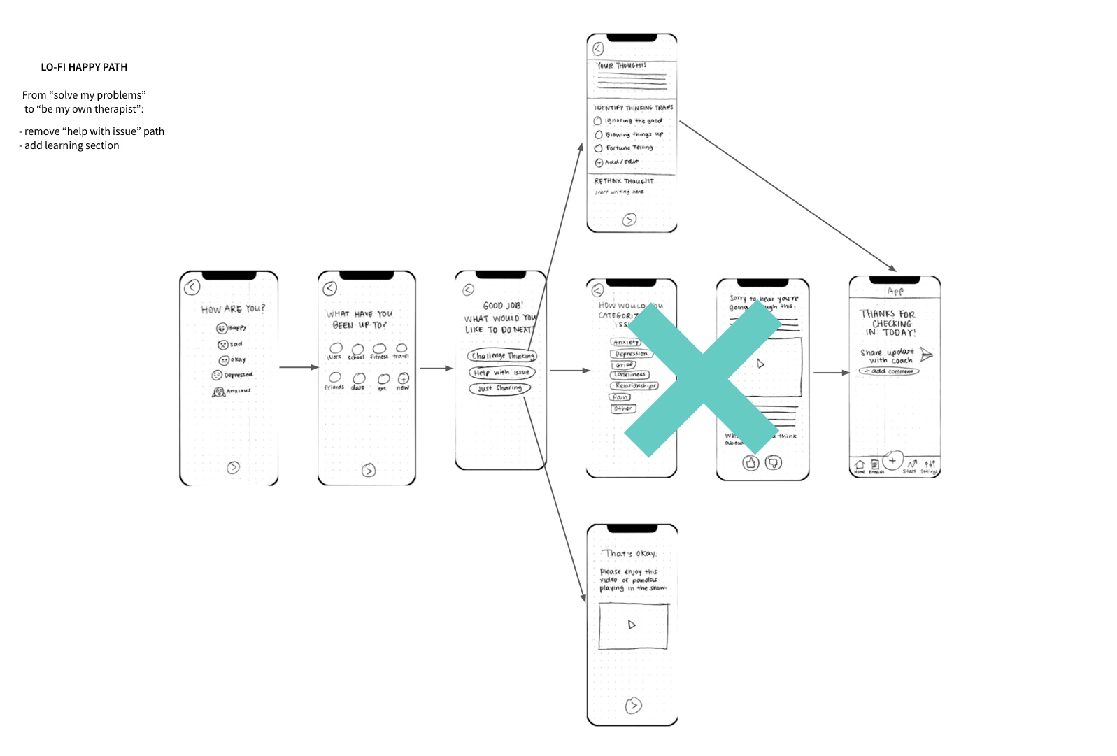
Mid-Fidelity
I iterated
from paper prototype to wireframe, making design changes based on user
feedback.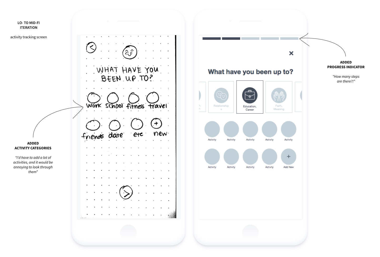
In this example, I added a carousel with six categories of activities. I had considered using a search bar instead, but I decided on this layout for two main reasons:
- Recognition (selecting activities from a list) requires less cognitive load compared to recollection (typing activities into a search bar).
- An important part of CBT includes incorporating various types of activities. As the user scrolls through the carousel, I wanted to aid the user to reflect more broadly on their day while also subtly reminding them to live more holistically.
Additionally, these categories could be useful in organizing and presenting user data as part of the statistics feature of the app.
I then conducted five usability tests. 100% stated that they liked the guided walk-thru of the happy path.
"I felt taken care of."
However, 100%
also had trouble with this screen.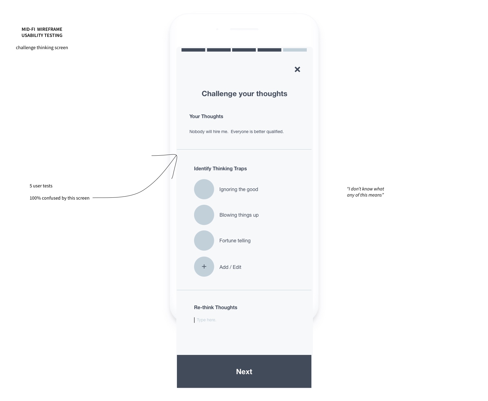
I decided I needed to include descriptive text to provide more clarity, and perhaps include onboarding in a future iteration.
Visual Design
In order to achieve a meaningful and cohesive visual identity for my app, I first determined the brand attributes it ought to possess based on the goals of the app and the needs of the target user:
- contemporary: to reflect a "fresh, updated image" as per the brief
- smart: to appeal to users looking for practical tools and resources that work
- friendly: to encourage users who desire empathy and feeling heard
- accessible: to convey that journaling and CBT is for anyone
After gathering inspiration from various
brands with similar brand attributes as my product, I created a created
a mood board, then conducted desirability testing to check if the
aesthetic communicates the attributes I intended.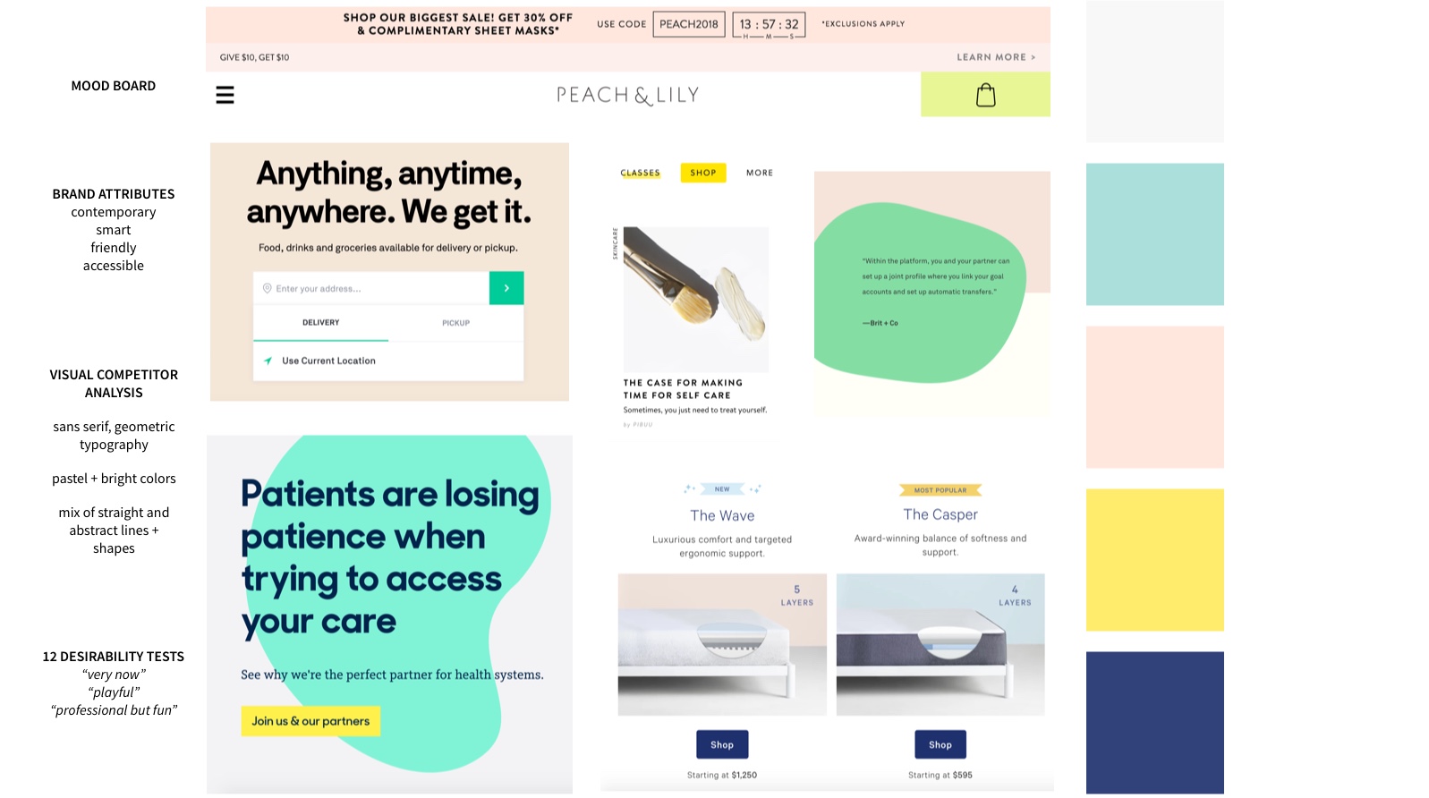
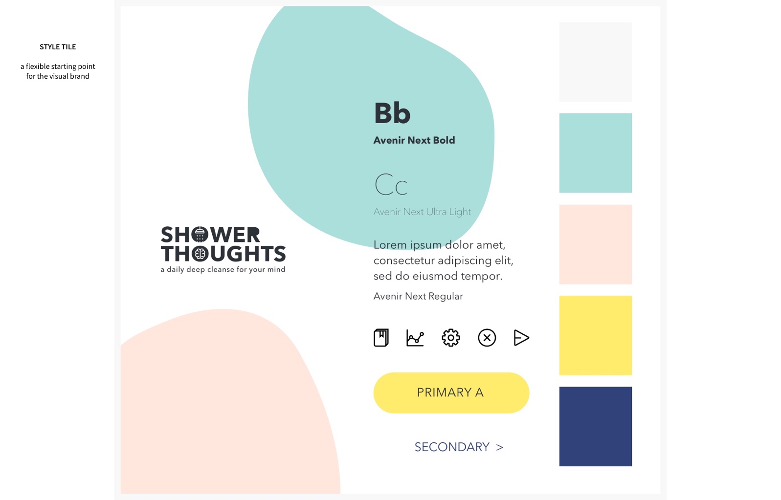
I then created a style tile as a flexible starting point for the UI. I took into consideration color psychology -- peach and teal are "calming" and "reassuring" (necessary for users who might be depressed or anxious), while yellow and navy were "confident" and "reliable" (necessary for users who are looking for a practical, reliable tool).
If it were a celebrity, it would be Reese Witherspoon.
Just as I did with the mood
board, I conducted 12 desirability tests that confirmed I was on the
right track.
I also simultaneously created a
style guide while working on the hi-fi to document the atomic elements
and ensure consistency throughout the app. 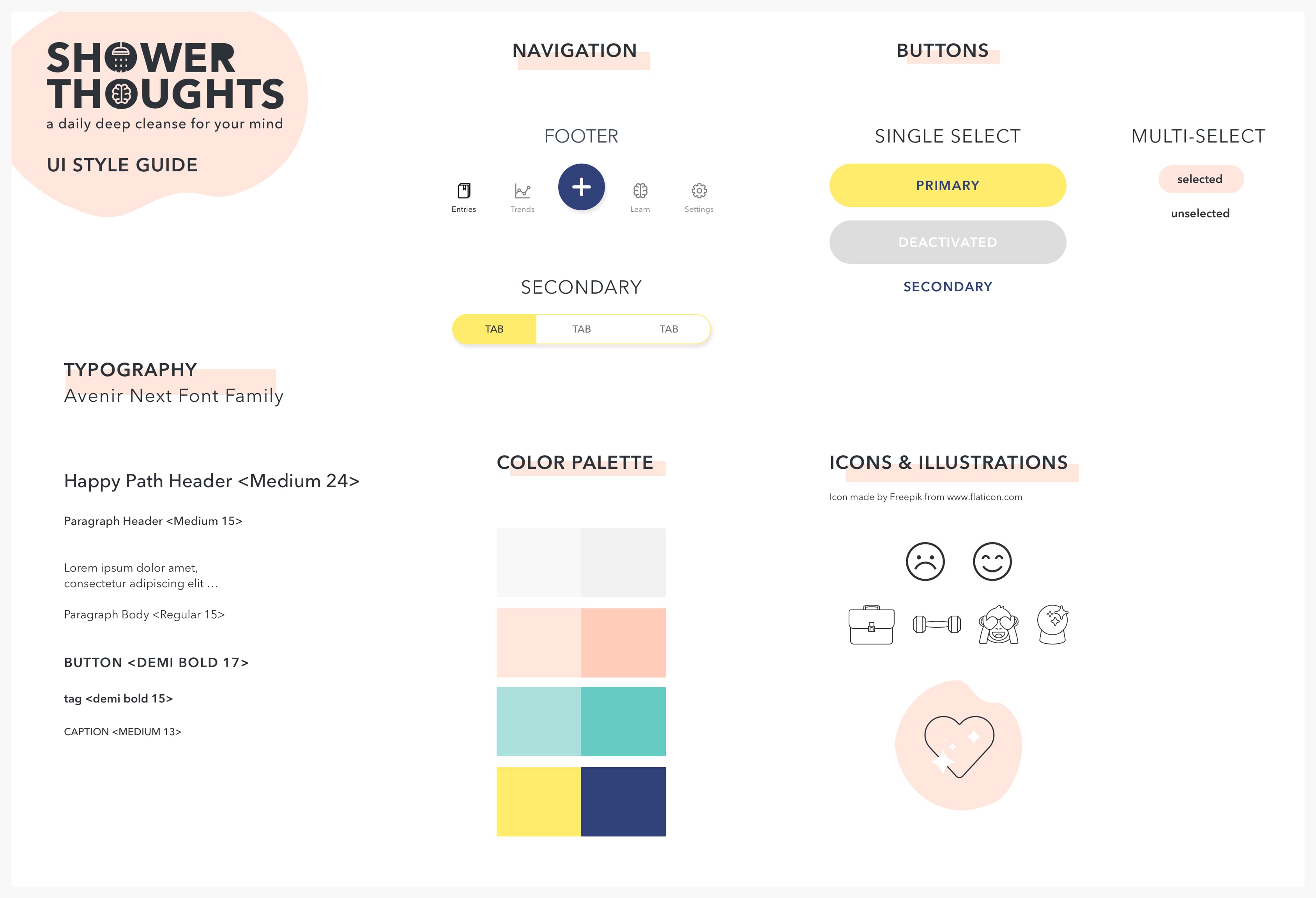
High-Fidelity
After all of the research and testing, I created a high-fidelity prototype of the app.
“I love how clean it looks. I’m all about that minimalism.”
I then conducted desirability tests on the first hi-fi iteration by asking seven users to describe the app using five words from Jennifer Aaker's Brand Personality Framework.
- 100% described the prototype as "contemporary" or "up-to-date" -- success!
- 6/7 described it as "sincere" or "honest" -- not one of my original brand attributes, but I'll take it.
- 4/7 described it as "cheerful" -- while I wanted the app to be "friendly", I felt that "cheerful" could potentially read too aggressive to users who may not be in a positive mood while using the app. I decided to tone it down by changing a couple of the particularly cheerful illustrations. My next step would be to A/B test the app with these new illustrations to check if I had indeed succeeded.
Below is the high-fidelity happy path after changing a couple of illustrations from the previous iteration. I also included a few microinteractions using Flinto to better demonstrate how the app would work.
Select Mood
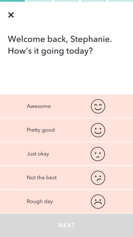
The user is prompted to select their current mood, and receives empathetic feedback to address their need to feel heard.
Select Activities
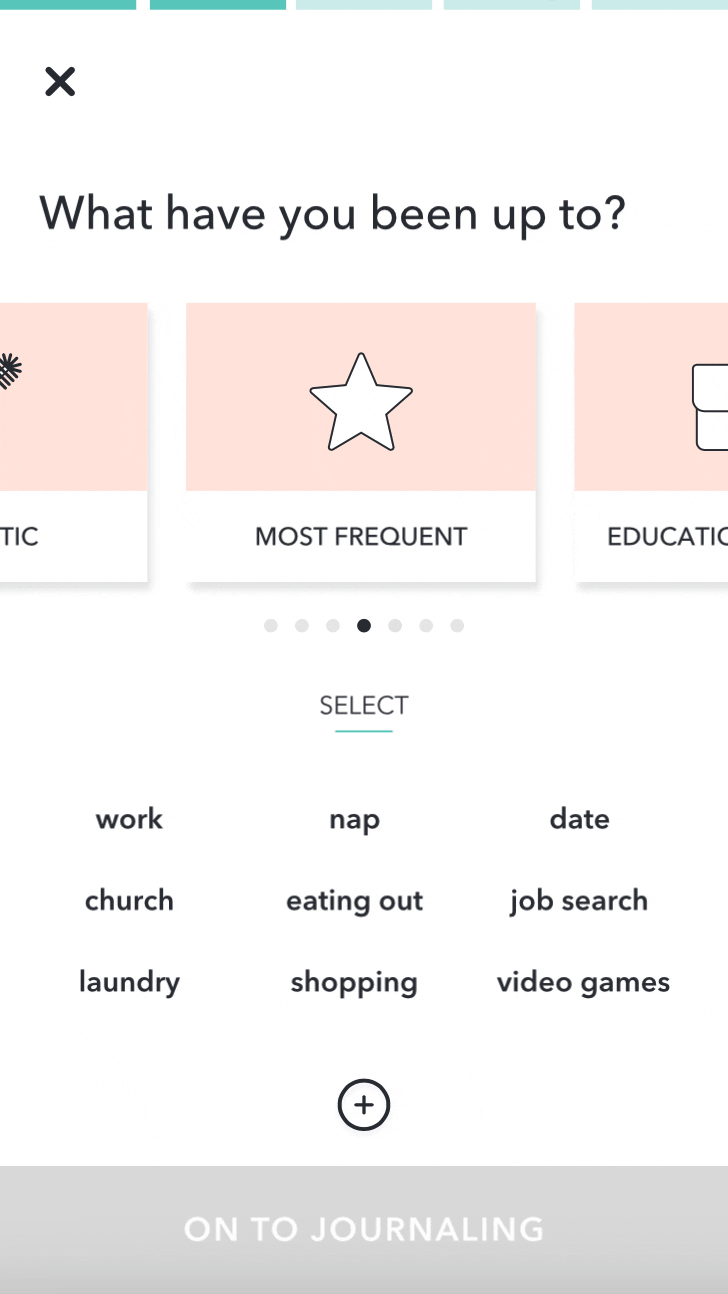
The user selects activities they've done that day by scrolling through a paginated carousel.
Journal
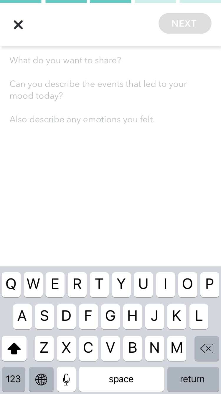
The user is prompted to journal with starter questions to address writer's block.
Option to Challenge Thinking
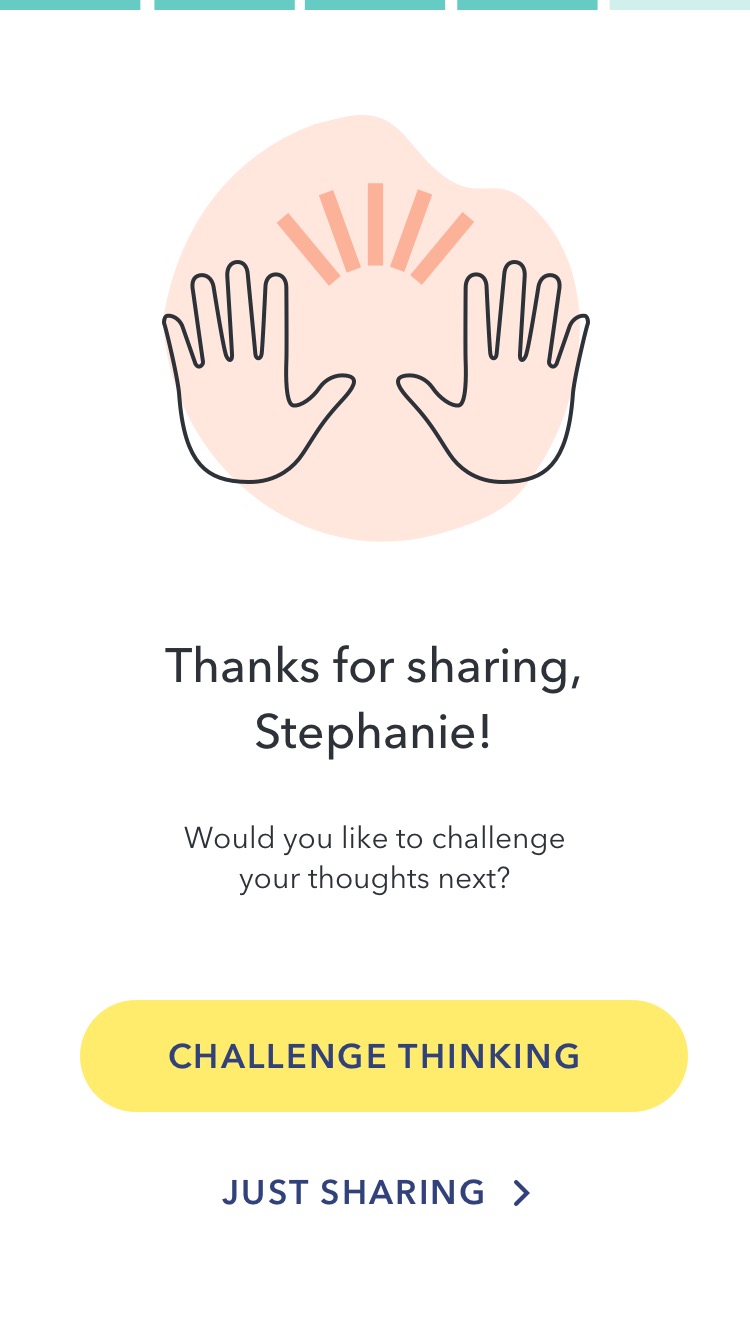
The user has an option to continue with a CBT exercise to bring a sense of closure to their journaling and to promote better emotional wellness.
Challenge Thinking Exercise

Illustrations and descriptive text provide clarity, while a sticky header enhances legibility.
Done!
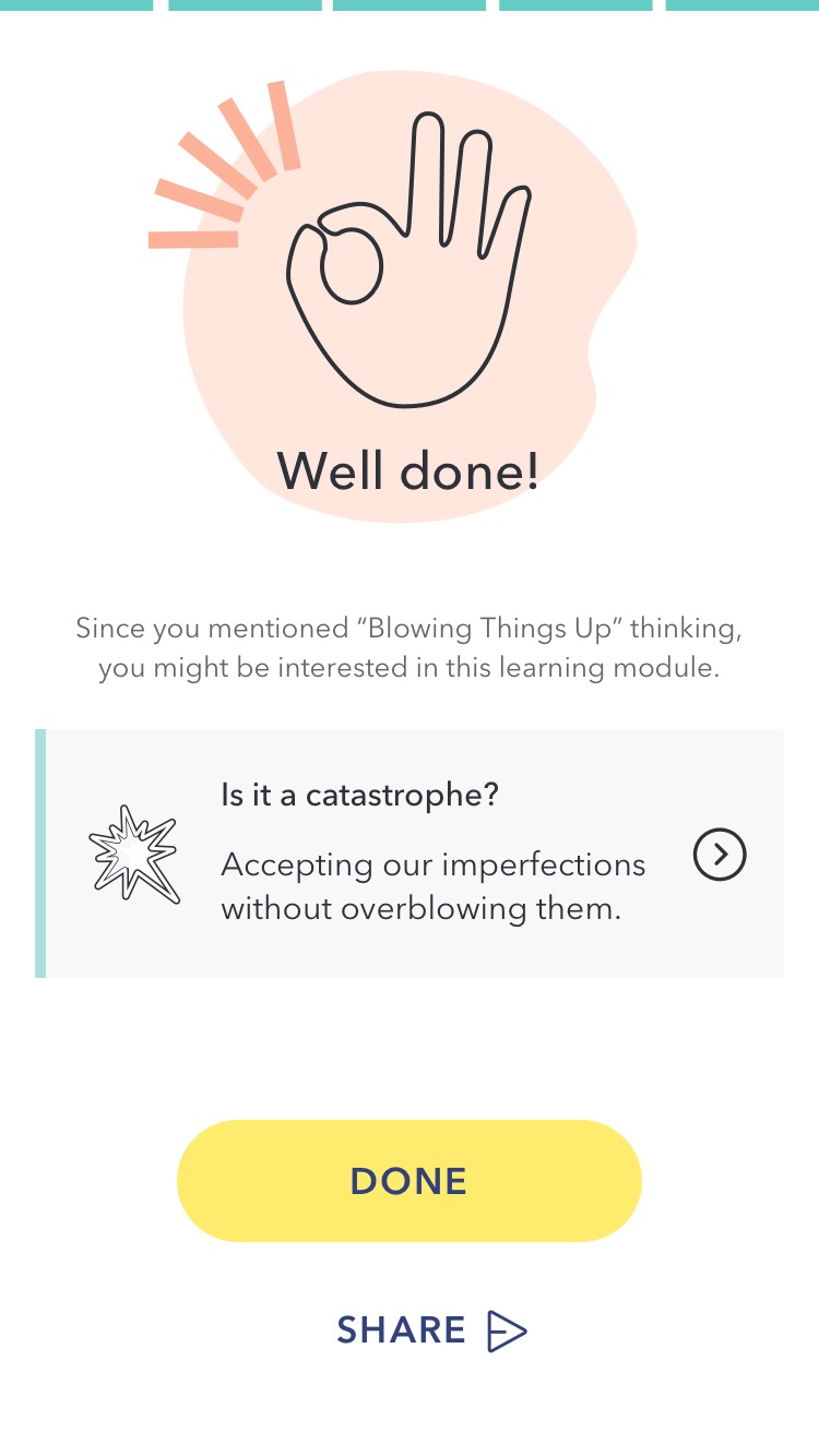
The user has an option to share an update with their wellness coach, as per the brief.
Next Steps
Continue to build, measure, and learn:
- A/B test Hi-Fi changes and iterate
- Create onboarding screens to briefly explain CBT and the value of journaling
- Build out other main features (stats, learn)
- Consider microinteractions (Create, Read, Update, Delete) for all user input
- Track logins, NPS, and membership metrics to determine whether or not the app is a success.